Photographer in Great Falls, MT | A Look into Our Home
Our family moved houses in April 2018 and I was ECSTATIC to get to do the whole decor thing all over again. Blank slate = heaven. I am not an interior designer, I’m not an expert, and would never consider myself to be one, but it is SO fun for me to mix different stuff together and LOVE the end result. I also happen to love to see how others decorate their space - because we are all so different in the styles that we love. Seeing the way others decorate is, to me, getting to know them a little bit more - so I thought I’d start off by sharing mine! Ultimately, I’d love to feature a new “space” on my blog every month…so be thinking if you’d be willing to let me come into your home…. ;)
“Like many of us, I’m a Joanna Gaines super-fan, and I ultimately have dreams that she ditched that Texas Fixer Upper to come up here and do a Montana version.”
Like many of us, I’m a Joanna Gaines super-fan, and I ultimately have dreams that she ditched that Texas Fixer Upper to come up here and do a Montana version. She probably just needs a change of pace, right? A little Big Sky Country for her and Chip…. What? It could happen…don’t rain on my parade. Her style is just so beautiful…and somehow it all comes together so nicely. It’s not too frilly, feminine, or stuffy, and the simplicity of the rooms she creates is basically what I dream about. Okay - enough about her. I want her life, let’s move on.
“So I would say my “style” is a mix of shabby-chic + rustic-meets-French-country, mixed with a little industrial. Simple, right?”
So I would say my “style” is a mix of shabby-chic + rustic-meets-French-country, mixed with a little industrial. Simple, right? ;-) And I needed to mix all of that together while maintaining simplicity, because too much stuff gives me anxiety. My worst nightmare is having to dust a bunch of nick-knacks. Plus, I have two kids, a dog, and a husband. Our house (and any surface available) is a free-for-all at any given time, and most of that cutesy stuff you find displayed beautifully on a coffee table wouldn’t last five seconds in our living room. I’ve come to peace with it. Moving on….
My favorite color EVER is blue, and so I wanted to incorporate that in my living room, where I knew we would be spending the most time. But blue is a really bold color, and frankly, it can be a little scary to go “bold” for me. I like vanilla…and neutrals…and blue is SO not neutral. And when I say “blue” I’m not talking navy. I’m talking cobalt. I told you…terrifying for this vanilla girl.
“Your family portraits are a great way to add some color to your room (regardless of which accent color you are using), so keep that in mind when it comes time to book your next family photo session!”
I started with our family photos. I made sure to bring that beautiful, bright blue into our outfits because I knew they would be displayed in the living/kitchen area. It really is a great way to add some color to your room (regardless of which accent color you are using), so keep that in mind when it comes time to book your next family photo session! A little planning can go a LONG way. I had them printed on wood from my professional lab, and that matte finish mixed with the sanded, rustic corners? Works so well with that shabby-chic thing goin’ on.
Fortunately, a lot of my decor from our last house worked well with my ideas for this one. Who am I kidding…please understand there was no “plan”, but somehow, it all came together. My drapes, kitchen table and chairs, coffee table, ottoman…all of this came with us which was important because, well…I’m not a millionaire. I can also be cheap, and my philosophy on new furniture purchases is usually, “the cheaper, the better”. I know, I know…there are many who believe that when you buy quality furniture it will last forever, but
styles change so quickly, I probably don’t want it to last forever, and
unless it’s made of steel, nothing is quality enough to survive two kids and a dog.
So most of the furniture you see in my house is from Wayfair. When my daughter got permanent marker on my kitchen table, I didn’t go into major depression so it seems to be working well for us!
This table is the perfect size for our living room/dining room/kitchen area (our living area is all very “open-concept”), and I love the mix of different materials - the wood table, the upholstered dining chairs, and then mixed with the industrial metal accent chair on each end. Mixing materials, for me, gives that added interest without the chaos of a bunch of different stuff.
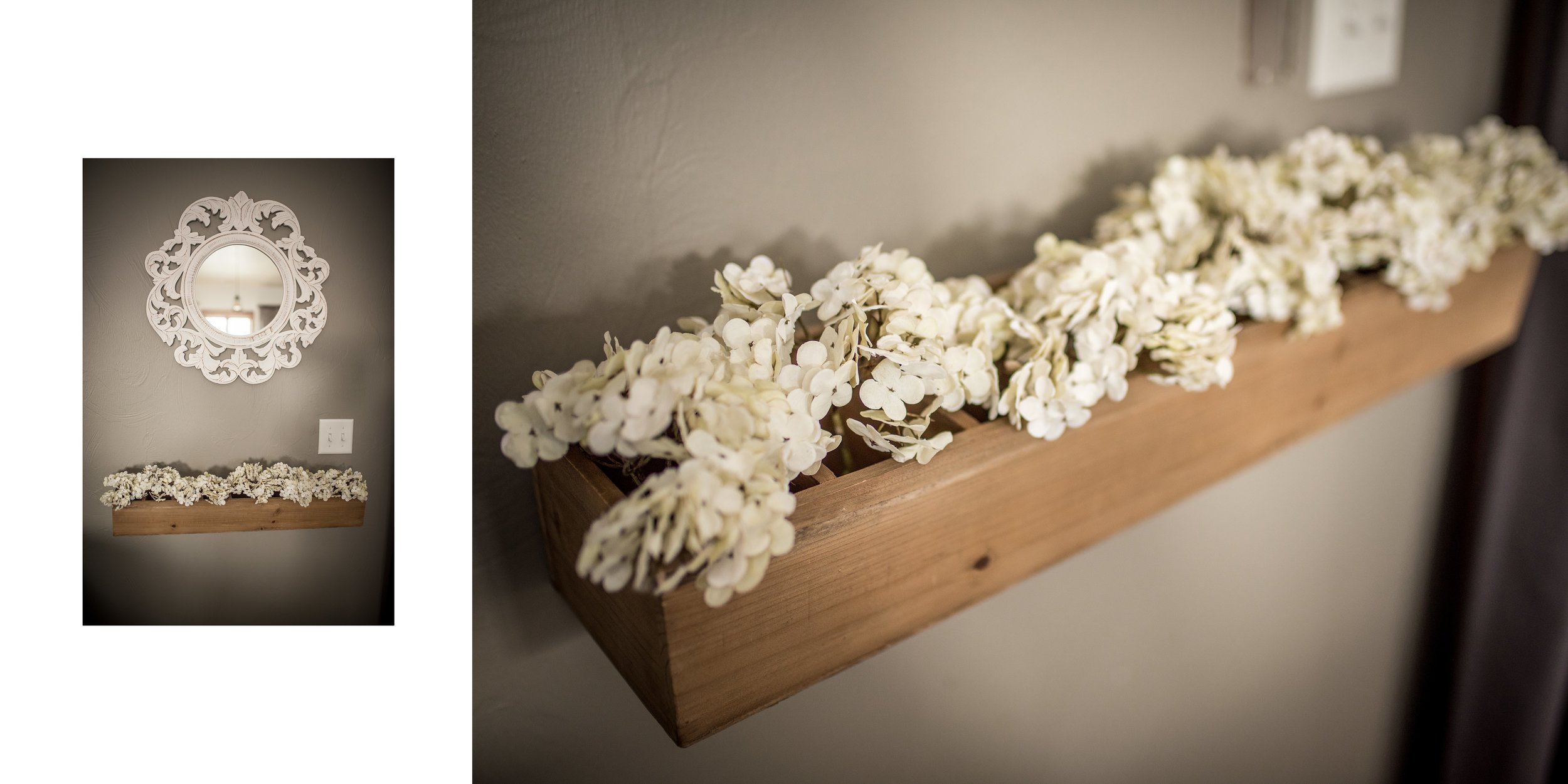
This mirror and flower box are, by far, my favorite decor look in the house. The mirror and flower box both came from Hobby Lobby, and I had Jason screw on some hooks to the back of the flower box in order to mount it to the wall. Some fake hydrangeas from Real Deals and that’s all she wrote! This is the only really feminine look I have going on in my house, and I love how it dresses everything else up just a little.
The most difficult part of the living/dining/kitchen to decorate was the huge wall in the living room that would hold our TV. From the second we purchased the house, I was trying to figure out what we could do with it. My original idea (which I would still LOVE to do) was to construct a built-out column about the width of a floor-to-ceiling fireplace and cover with ship lap. I thought it would break up that massive wall, make it look interesting, and give it a little dimension and “custom-ness” that you sometimes lose with a spec home. Well, people…I can’t build. And Jason wasn’t feelin’ it. Boo.
Plan B: I found this AWESOME TV cabinet from Hayneedle (similar to Wayfair), it fits - and hides - our TV perfectly, and it’s the second-best option I’ve found. I love that it is a mirror, so it reflects all of that light coming through the windows. Mirrors also tend to make spaces look larger, so…win-win-win!
To fill up some space to the left and right of the TV cabinet, I added two signs I created through an online company called Smallwoods. I kept looking for vertical signs that would be big enough, but they really didn’t have anything that would work. However, they do give you the option to create your own, so I did a little graphic design work and it all came together great!
I was still missing something on the top of cabinet (too much space), and so I added a galvanized metal arch from Hobby Lobby. I think it totally goes with the French-country-meets-industrial look, so I couldn’t be happier with this space-filler! I added some pops of blue with those pillow covers (also Hobby Lobby) to bring some blue into the living room, and…done!
My kitchen is the most simple and least decorated of the entire space. Mostly because it has enough crazy going on at any moment…I didn’t need to add to that. I also wanted it to be REALLY easy to keep clean, and more stuff = more stuff to clean. My dream is to eventually add a pretty tiled back splash, stone counter-tops, and a cute awning over the window. Someday….
When we first moved into our house, these small pendant lights had the traditional “bell-shaped” glass shade around them. Traditional isn’t my favorite, so we swapped them out for these cage light fitters from Home Depot for $15. Lighting is amazing in how easily (and sometimes, inexpensively) it can transform the look of your space. I’m not a huge fan of the chandeliers that came with the rest of our house, so eventually I’d love to change those out, too! Hopefully my husband doesn’t read this post!
The tufted cream kitchen stools (also from Wayfair!) were a risky purchase (off-white fabric + kids = no bueno), but I figured they probably wouldn’t get used that often, given our kitchen table was three feet away. False. The kids are on these stools ALL THE TIME. This is Mia’s favorite place to paint, help decorate cookies, eat…you know, all the things that are messy. And I love that she loves to be in on all the action of the kitchen, so the stools are fair game. Surprisingly, they’ve held up pretty well! I use the Netepur bar from H20 at Home to really get into some of those stains, and then we are ready for Round 2 (or probably 100, in our case)!
The entry way is narrow in our house, and because “simple” is the name of my game…I held to it :-) Those faux windows on the walls are actually supposed to be picture frames, which you would think this photographer would be ALL about, but I didn’t want to overwhelm our space with photos so I left them empty. I love that they add a little of that country/rustic charm.
And the last of our kitchen/dining/living space! This fun little nook :-) Eventually I’d love for this to be a full-on drink station (coffee, wine, mini fridge underneath), but for now it’s our Keurig station! And even now, as I’m looking at these images, I’m thinking “there is too much stuff going on!” on those shelves! See? I have a problem….
Well, I hope you all enjoyed this sneak peek into our home! If you want to keep up with this blog and all of the other fun stuff (and homes!) I will feature, make sure you subscribe below!
All the love,
~Bridgette


